For years I’ve used Courier New in my programming editors and terminal (PuTTY). But there’s a much better font available for that kind of stuff. For the last couple of years I’ve been using Consolas, which is shipped with Windows. I’ve configured my editors and PuTTY to use Consolas 10pt bold as I find it by far the best readable font to use for programming. This font is just the right size at 10pt and setting it to bold gives it a very smooth look.
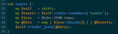
Here’s how Consolas 10pt bold looks in GVim on Windows 8:
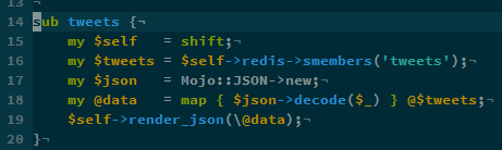
Recently I’ve given some other fonts a try as well because in the showed examples it appears they make a nice programming font. Not too long ago the Adobe Source Code Pro font was released and looking at the screenshot at that page it looks really nice. So I decided to download and install it. But trying it in GVim didn’t gave a satisfying result. It doesn’t look too bad, but it isn’t as compact as Consolas is:
When using Linux (Ubuntu) I always use Droid Sans Mono. But for some reason it looks really bad on Windows:
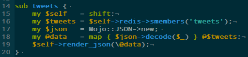
As you can see Droid Sans Mono is even bigger and just doesn’t look right. I wonder why this is though I suspect it has to do with the font rendering on Windows. I’ve found font rendering on Linux a lot better and for what I’ve seen on Mac OSX as well, though I’ve recently heard a Mac user saying he found the font rendering on Linux even better.
And OK, the fonts don’t look that bad but imagine having to look at it all day when programming. All these examples have been set at 10pt bold and the extra space taken by both Adobe Source Code Pro and Droid Sans Mono is just bad in my opinion.
So far I haven’t found anything better than Consolas when it comes to a programming font on Windows. I’m not looking for a replacement of it but I’m always willing to try something new or different. My main disappointment I think comes with how bad Windows renders these fonts, because I know Droid Sans Mono looks good on Linux. If there’s any programming font that renders really well on Windows I’d really like to hear about it.
I thought I was the only lunatic using Droid Sans Mono, outside of an Android.
Consolas:11 is my favourite though, so I’ve just learned to install it on any system I need to use. Works great with ClearType and other SPRs too.
My shortlist:
Lucida Console
Liberation Mono
Consolas
Source Code Pro
Droid Sans Mono
The spacing of consolas feels very ‘neat and tidy’ and well suited to reading code rather than just glancing at it.
I’ve got mappings like this in .vimrc that make comparisons easier:
nnoremap 1 :set guifont=Lucida\ Console\ 10
nnoremap 11 :set guifont=Lucida\ Console\ 11
nnoremap 2 :set guifont=Consolas\ 11
nnoremap 22 :set guifont=Consolas\ 12
…etc
I just tried Liberation Mono on bold and 10pt which looks good as well. Though still not as nice as Consolas. And when not set to bold Droid Sans Mono looks OK on Windows as well. Still, I’ll stick to Consolas.
My top two are Consolas and Source Code Pro. What I like about SCP over Consolas is the line spacing. I can run it at 10pt and it’s very readable and the lines don’t look like they’re crowding each other. Consolas I have to run at 11pt to avoid that ‘crowded’ look, but it’s got more clarity at the loss of maybe just a couple of lines on my screen. I’m currently a bit schizo over which I like best at the moment…. heh
Just looked at Droid Sans Mono again in Ubuntu and there it looks ugly when in bold as well. When using normal it looks nice. On Windows as well. I’ll be sticking to Consolas bold though :-).
Droid Sans Mono has no bold variant so by using bold, Windows is creating fake bold which is why it looks ugly. When using Droid Sans Mono just don’t use bold.
It’s possible you haven’t had this issue on Linux because it’s not doing fake bold or it does a better fake bold than Windows.
I prefer the bold look though. I have since been using Consolas which has been very pleasing to the eyes. If I’ll ever move back to Linux desktop (which is unlikely) I’d probably use Droid Sans Mono again.